DCUBE - Kid’s Science Museum
Brand Identity
Installation
Installation

Intro:
"There's THE CUBE!" says the child in the car while passing by the Discovery Cube building. DCUBE, a new name and identity for Discovery Center, holds the micro and macros of the universe. It is a space for children to see science in a new point of view: from SCOPE to SCOPE.


DSCOPE Font Design:
Each letter is like a lab sample. The cropped corners resemble a slide that is inserted into a microscope. The font is formed using the grid of a viewfinder located inside a scope.


SCOPE TO SCOPE Sub-brand:
SCOPE to SCOPE is a new sub-brand that captures the infinite space one can discover through two different lenses; from looking down at tiny cells on a microscope to looking up at planets on a telescope.

Stationery:
Every kid is an essential element in the world of science. Using one's initials, each piece such as a nametag is designed as if it's a new element on the periodic table. A view-master is a handy scope to carry back home.


Environmental Graphics:
The cube is a giant scope that projects upcoming special events such as the Dino Quest. Seeing the new logo and color on the rocketship displayed next to DCUBE, passersby can get a glimspe of what to look out for which creates new opportunities for parents and children to have fun together.
UX/UI:
Having a unified digital presence through web, mobile, and social media help parents and children to scope further out beyond the physical museum.
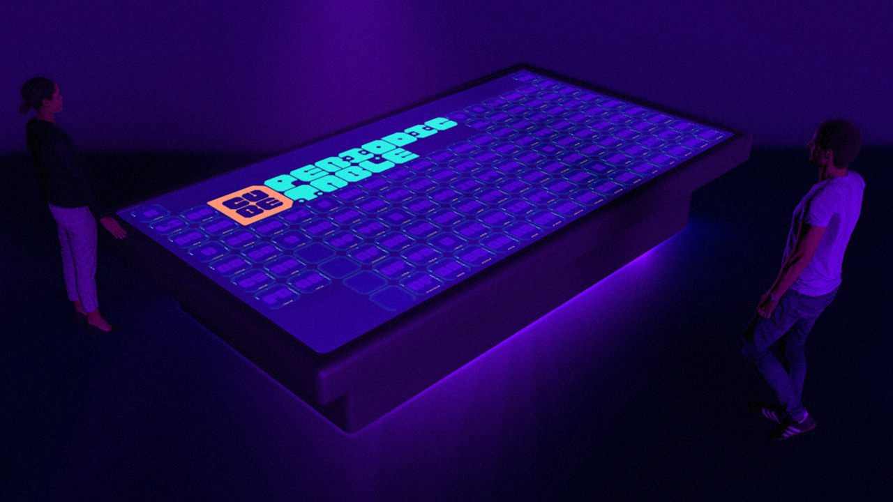

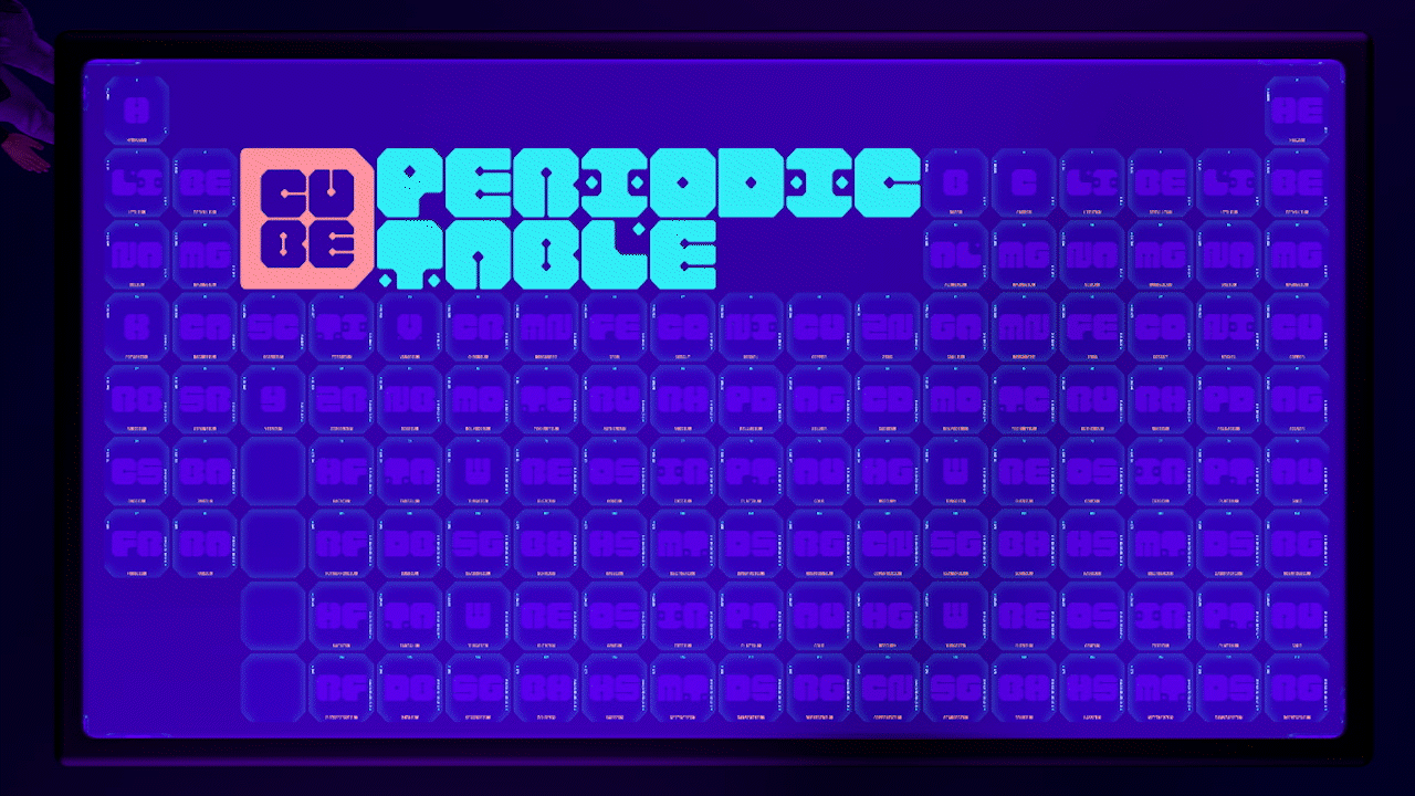
Installation [DPERIODIC TABLE]:
A periodic table in a form of a life-size table is brought to life beyond science textbooks. Being able to click on each element to discover its image gives a hands-on experience for children to remember and learn.