The Weather Channel
Brand Identity
Motion Design
Motion Design
Intro:
“What’s the weather like today?” Before the TV and smartphone existed, looking outside the window was the common way to check the weather for that day. Now, The Weather Channel provides plentiful weather-related news through various devices in America. In the midst of the current climate crisis, how can a dependable news source be a hopeful voice today? The Weather Channel rebrand invites the audience to “look out the window” and join the movement to build a better future.
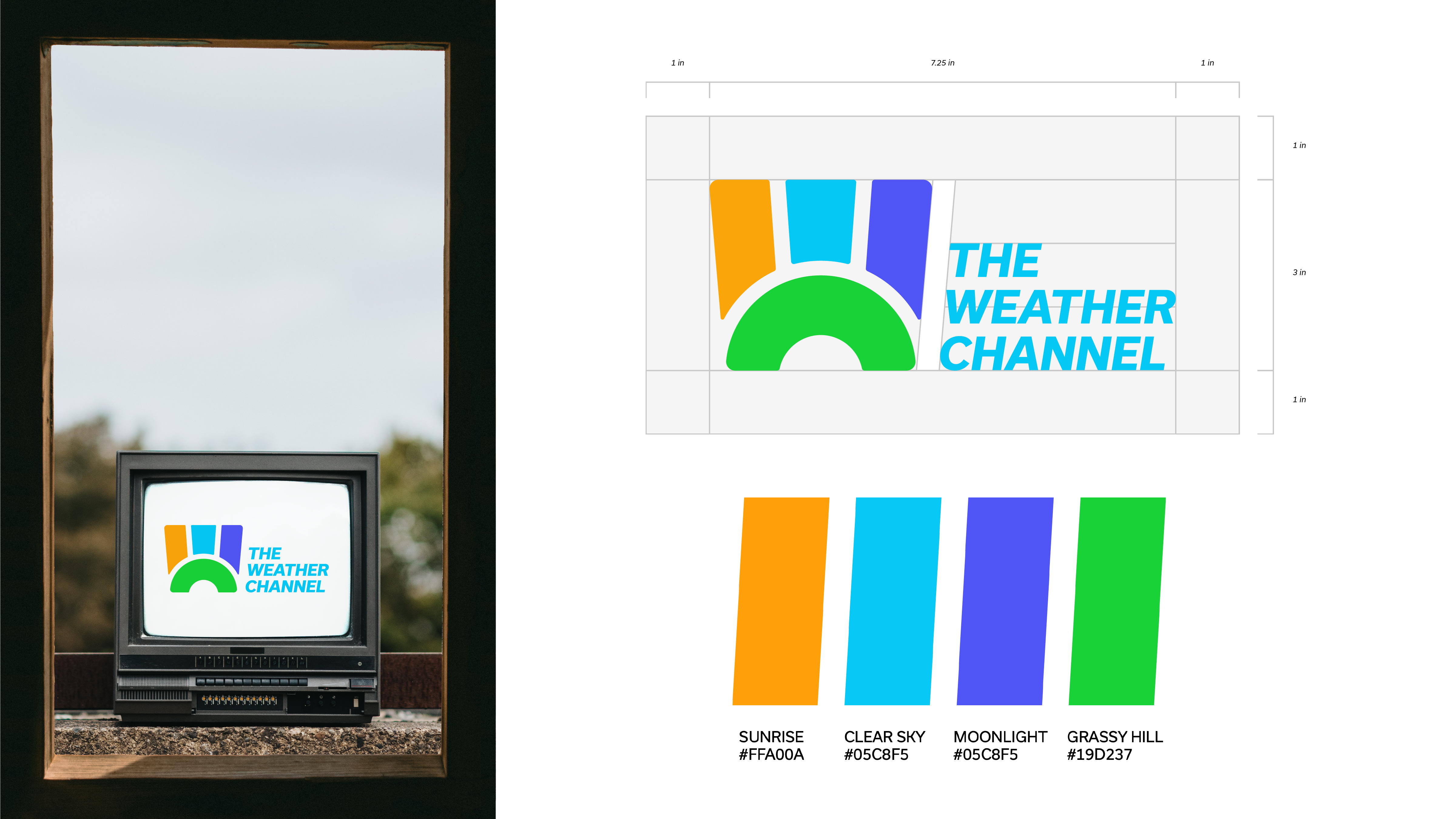
Logo & Colors:
Many would imagine a bright blue sky hovering over a nice grassy hill is the ideal weather. Using the “W” as sunrays and the “C” as the hill, an image of such scenery is revealed. Using the tapered round corners of an old television, the logoform instills nostalgia of watching the weather forecast on TV. From sunrise to moonlight, each day goes by working for a better tomorrow.

Icons:
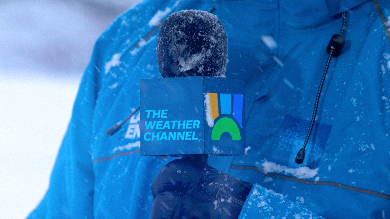
Because weather icons are one of the prominent graphics in forecasting, applying the new brand graphics forms a friendly personality for The Weather Channel. This will be used on other platforms aside from the current weather app to promote the brand.
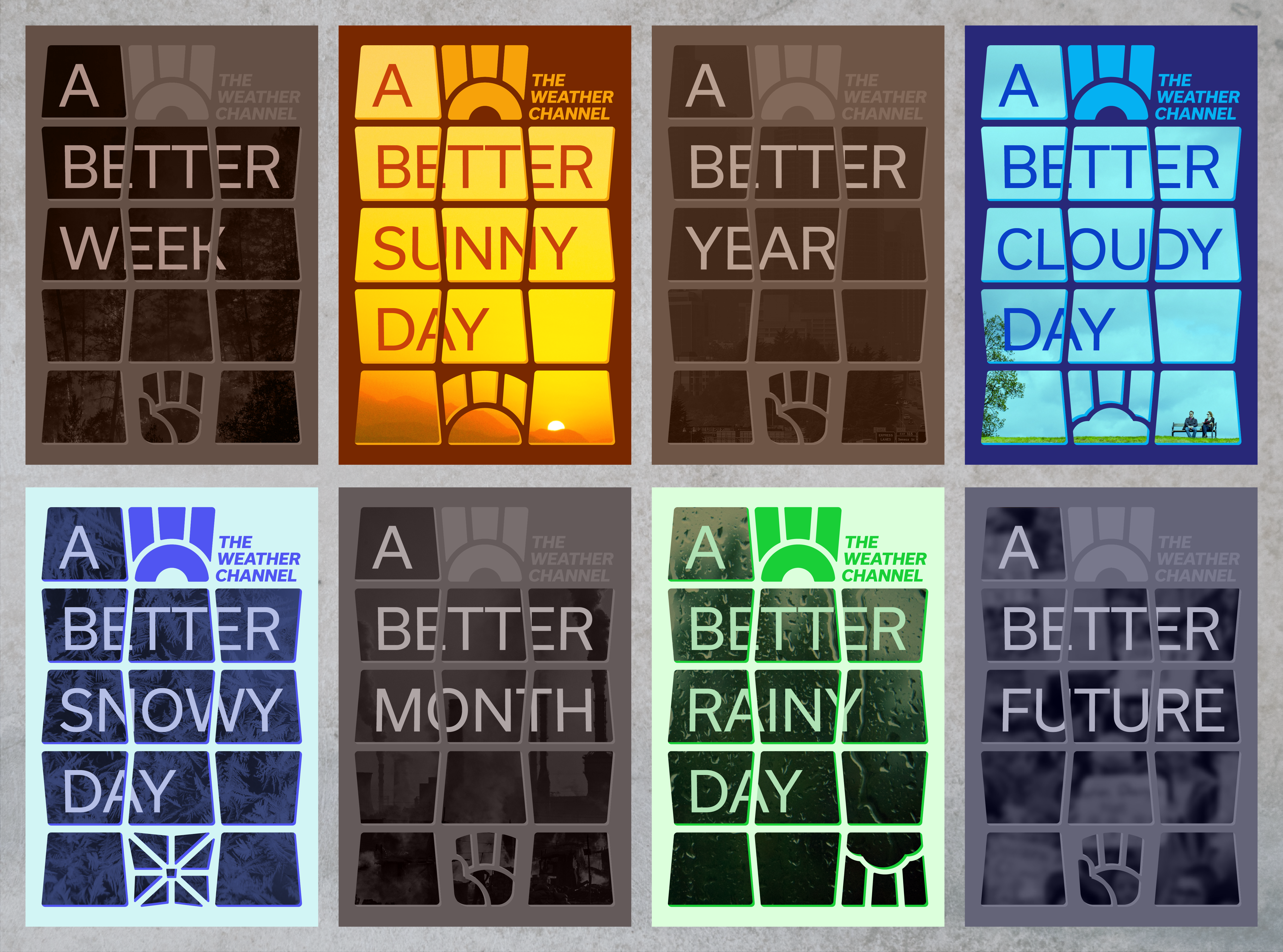

Posters:
Each poster is a window to a potential future. The juxtaposition of the serious climate change posters and the bright weather posters educates people about climate change and encourages everyone to hope for a better future by participating in local communities that are taking action.


Travel Posters:
Just as one wipes a window to see clearly, The Weather Channel provides forecasts for people traveling in and out of America. Using phrases such as “build a snowman” brings warmth to The Weather Channel’s voice.